Can You Use a Spreadsheet to Teach People How to Use Spreadsheets?
Aug 13,2014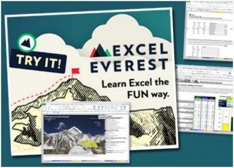
About a year ago and a half ago here at Excel Everest, I started thinking that it might be possible to write an interactive book about how to use Excel but entirely within Microsoft Excel. I imagined in the entire product self-contained one document and it would have instructional text, automatically graded exercises, embedded videos, a library, easy to use navigational buttons, and a scoreboard that graded the user along the way. After a little exploration and with the help of a few friends, I built Excel Everest (www.ExcelEverest.com), and founded a company to offer it to others. We’re excited at how business is progressing and large companies are beginning to use the tutorial for their internal Excel training (including Google, PlayCore, and others).
We think the secret sauce of Excel Everest is a set of design principles we followed through the course of development. We’d like to share these and propose that they’re broadly applicable to any learning technology that contains interactive elements. They are struggle, immediacy, delight, progress, beauty and navigational ease.
--
Struggle
Learning is hard and often it should be, as increasingly scientists are discovering that emotion and memory are intertwined. Intuitively, this makes sense. Look back on your life and pick out the memories that are most vivid. Generally, they’re the times of greatest emotion. While learning anything new, if it is spoon fed to you and there’s no struggle involved, you’re more prone to completely forgetting it. An instructional video that shows you how to do something, for example, yields little retention without struggling through the task yourself.
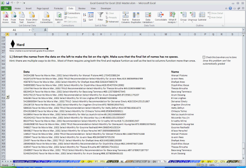
In Excel Everest, we tried to strike a careful balance between frustrating the user and providing enough tips and tricks to make the exercises possible. We also included easy, medium, and hard exercises on all of our topics so users of various backgrounds are able to hit that perfect point of struggle. Excel Everest is not easy. It was not meant to be.
"I just finished a huge data project for which I used a bunch of the new Excel tools I learned, including vlookup and pivot tables. This module has been a lot of work, but has been very useful for me.” - Google Employee
Immediacy
Ask anyone who studies giving feedback in an organization and they’ll say that immediacy makes feedback more powerful, and the longer you wait to give it, the less it works to change behavior. There’s a key window after you complete a task where you remember and understand it enough to receive feedback that’s valuable to course correct a behaviour. The sort of annual performance reviews, for instance, are generally considered to be of little value to actually providing good feedback. Feedback needs to be embedded into the culture of an organization and be provided instantaneously.
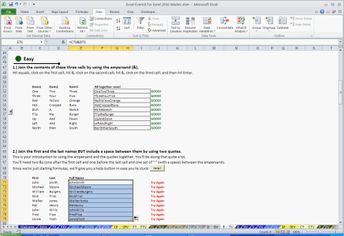
We believe these same principles apply to learning tools and the best textbook is one that tells you what you’re doing right or wrong as you do it. In Excel Everest, every exercise that can be automatically graded is automatically graded, so you instantly know if you’ve done something correctly. If you mess up, the tutorial says “Try again.” If you do it correctly, the tutorial says “Good!”.
“It teaches you various Excel topics, one at a time and gives you some problems to work on. Once you finish the problems, Excel Everest even grades you automatically. Pretty cool, eh?” - Chandoo from Chandoo.org, Excel Expert and Microsoft MVP
Delight
Fun should be a part of the process of learning anything. More important than fun however, is surprise, because it triggers more of an emotional response and provides a boost to keep going. If a user is surprised by a joke, an unexpected animation, a fun image, or an unusual exercise, the chance that they’ll keep at it to see what’s next increases.
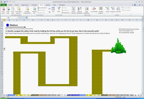
Excel Everest has countless moments of surprise. In addition to a “fun button” whose purpose is simply to trigger stars to light up and have a bear dance across the screen, Excel Everest embeds delight within the exercises. In an exercise on using the paste special function, for example, users are surprised when they complete the exercises correctly, only to see that the result of their work is an image of a man smoking a pipe. In another example, Excel Everest makes the user follow a yellow brick road using only navigational keyboard shortcuts to get to an emerald castle. We think touches like these wow users and keep them learning.
"I have been going through it for a few hours, let me first say that this is probably the most amazing thing I have ever seen." - Google Employee
Progress
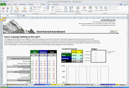
Users who are in the process of learning a topic should be exposed to not only a microscopic view of how they’re doing (on each problem, for instance) but also a macroscopic view of their progress (their overall level of success). Keeping a broad perspective on ones progress in context of the whole body of material is important for a holistic understanding of the material being learned or completed. Imagine playing Mario Brothers, for instance, without a map of all of the worlds.
All of the exercises in Excel Everest are linked back to a central scoreboard that shows a user how much they’ve completed overall, how much they’ve completed in specific topic areas, and even awards badges at certain milestones. All of this is done automatically. This gives the user a sense of overall progress and allows them to set their own goals.
Beauty
Design and beauty is important in learning technology. A beautiful, well designed product is one that draws a user in and keeps them there. In the early days of social networking for example, so many of the designs were visually ugly. One of the key differentiators of Facebook was its simple, clean, and beautiful user interface. It had a structure that made sense and didn’t change between the pages. Its visual design made its functionality obvious.
When building Excel Everest, we put extremely careful thought into how it looked. This included color scheme, font, organization, and style.
"I've never seen an Excel sheet anything close to as cool as this. I'm blown away." - Google Employee
Navigational Ease
Whereas learning should be a bit of a struggle, navigating inside a learning tool should be elegant. Any extra thought and clicks that are needed to get a user to an area or place where they can learn represent lost effort that could be spent learning the material itself. As much as possible, everything that someone needs to complete a task should be in their immediate view, or if that’s not possible, very close by.
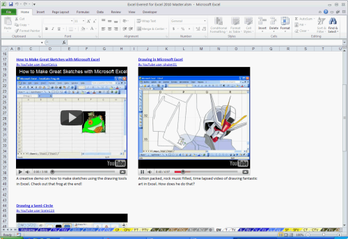
We organized Excel Everest so that a user doesn’t notice the organization. All of the buttons are obvious and intuitive and allow the user to navigate between the modules without thinking. The minute a user is done with one module, there’s a button that takes him or her to the next. If a user wants to quickly get to the top of a topic area, the furthest left column of the topics in Excel Everest have buttons that look like little up arrows and shuttle a user straight to the top of the tutorial. In addition, the YouTube videos in Excel Everest are all embedded right there in the document. It’s possible to watch them right from inside the file without opening a web browser. We strove to make everything our users need in Excel Everest right at their fingertips.
About the Author